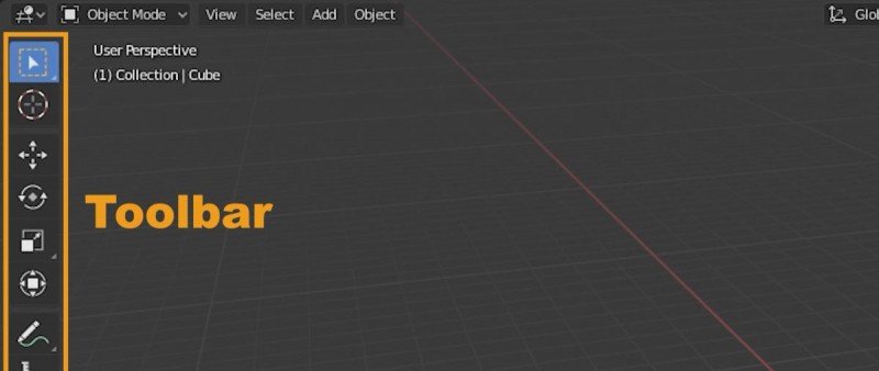
Understanding the Toolbar:
Located on the left side of your screen, the toolbar column is an indispensable feature in certain editors within Blender. It acts as a repository for a comprehensive list of tools that dynamically change based on the active editor mode. By organizing and customizing the toolbar, you can streamline your workflow and access the necessary tools swiftly.
Resizing the Toolbar:
The first step in optimizing the toolbar is to determine its size and layout. Blender 2.8 and later versions offers three display options: single icon row, dual column row, and icon with text. Resizing the toolbar enables you to conserve screen space or display additional information, depending on your requirements.
1. Single Icon Row:
This configuration reduces the toolbar to a single row of icons. Ideal for experienced users who are familiar with the tool icons and their respective functionalities, the single icon row maximizes screen real estate. To switch between tools, hover over the icons to reveal their tooltips.
2. Dual Column Row:
The dual column row layout displays the toolbar as two vertical columns of icons. This arrangement allows for a larger number of tools to be visible simultaneously, making it beneficial for users who prefer visual cues. The dual column row facilitates quick tool selection, minimizing the need for hovering over icons to identify their functions.
3. Icon and Text:
For users who are less acquainted with the tool icons, the icon and text layout provides the best of both worlds. This arrangement displays both the tool icon and its corresponding text label, making it easier to identify tools without relying solely on visual memory. The icon and text layout ensures accessibility, particularly for beginners or users who frequently work with unfamiliar tools.
Choosing the Ideal Configuration:
Determining the ideal toolbar arrangement relies on a combination of personal preference and practical considerations. Consider the following factors when choosing your configuration:
Familiarity with Tools:
If you are well-versed in Blender's toolset and their respective icons, the single icon row can be an efficient choice. This setup maximizes screen space and allows for a clutter-free workspace.
Visual Cues:
Users who rely on visual cues or frequently switch between various tools may find the dual column row layout beneficial. The increased number of visible tools reduces the time spent searching for specific functionalities.
Accessibility:
For newcomers to Blender or individuals working with unfamiliar tools, the icon and text layout is recommended. This configuration provides clear visual representation and aids in quickly locating the required tool by reading the accompanying text labels.
Conclusion:
Arranging the Blender 3.5 toolbar to suit your workflow can significantly enhance productivity and streamline your creative process. By resizing the toolbar and selecting the most appropriate layout, you can optimize your workspace and access the necessary tools efficiently. Consider your familiarity with the tools, reliance on visual cues, and the accessibility required when choosing the ideal toolbar arrangement. With a well-organized toolbar, you can unleash the full potential of Blender 3.5 and elevate your 3D design and animation projects to new heights.
Author: E.Mulas @electronicmulas


